
White Labeling
Customize your Magistrala deployment's organization name, colors, logos, favicon, and links so it looks like your own product.
White Labeling is available on Enterprise Edition deployments only, and only to users with the Admin role.
White Labeling lets you replace Magistrala's own branding with your own across the entire app — organization name, theme colors, logos, favicon, social share image, and outbound links — without a rebuild or redeploy. Changes take effect as soon as they're saved.
This guide walks through every option on the White Labeling page using a worked example: rebranding a deployment for a fictional customer, Acme Enterprises.
Accessing White Labeling
Open the user menu in the top-right corner of the app (click your avatar) and select White Labeling.
You can also reach it from Platform Management → White Labeling, alongside the Workspaces and Users admin tabs. Both paths lead to the same page, /platform-management/white-labeling; the user menu is just the faster route.
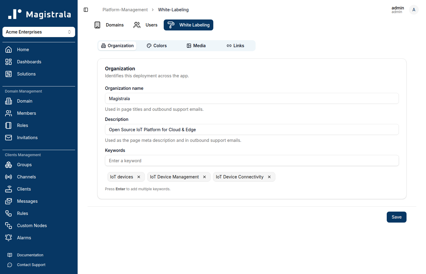
The page has four tabs — Organization, Colors, Media, and Links — plus a single Save button at the bottom that writes every tab's changes at once. Editing a tab doesn't save it; only Save commits your changes, and unsaved edits are shared across tabs until you click it.
Organization
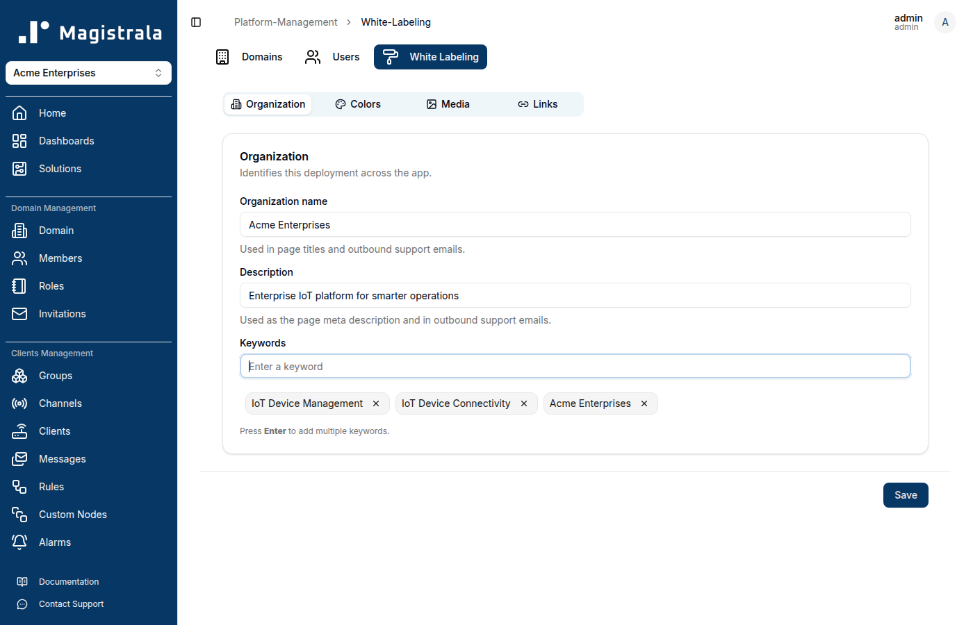
The Organization tab controls the deployment's identity: its name, meta description, and search/SEO keywords.
| Field | Where it shows up |
|---|---|
| Organization name | Browser tab titles, and outbound support emails |
| Description | The page's meta description, and outbound support emails |
| Keywords | Page meta keywords, used for SEO |
Keywords are managed as chips: type a value into the field and press Enter to add it, or click the × on an existing chip to remove it.
Colors
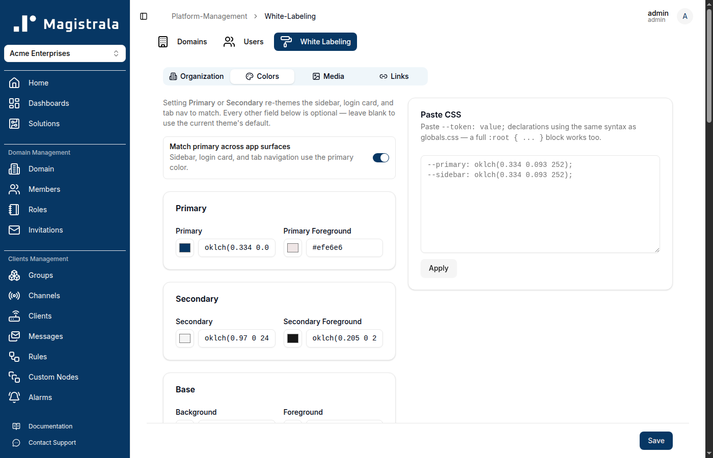
The Colors tab re-themes the app using the same design tokens as the underlying component library, so every color used anywhere in the UI can be overridden.
A few things worth knowing before you touch this tab:
- Setting Primary or Secondary alone goes a long way. These two are the only colors most deployments need — every other field is optional and falls back to the current theme's default when left blank.
- "Match primary across app surfaces" is on by default. With it enabled, the sidebar, login card, and tab navigation bar all follow your Primary color automatically. Turn it off if you want to set those surfaces to different colors than Primary using the individual Sidebar, Login card, and Tab nav fields further down.
- Color fields accept hex. Each field shows an existing value as an
oklch(...)string (the format the app's theme is defined in), but you can type or paste a standard hex code —#1E3A8A, for example — directly into the text box, and the swatch next to it updates to match. You don't need to convert anything yourself. - Foreground colors are for text/icons drawn on top of the matching background color (e.g. Primary Foreground is the text color used on Primary-colored surfaces). Leave these blank unless you have a specific contrast requirement — the app already picks readable defaults.
- Further down the tab, individual sections let you override Base (background/foreground), Muted, Accent, Card, Popover, Destructive, Borders & focus, Charts, Sidebar, Login card, and Tab nav colors independently.
- A Paste CSS box on the right accepts raw
--token: value;declarations (or a full:root { ... }block copied fromglobals.css) — useful if you already have a design token export and don't want to fill in each field by hand. Click Apply to load them into the form (this doesn't save on its own — you still need Save).
For Acme Enterprises, only Primary (#1E3A8A, a navy blue) and Secondary (#F59E0B, amber) were set — everything else was left at its default:
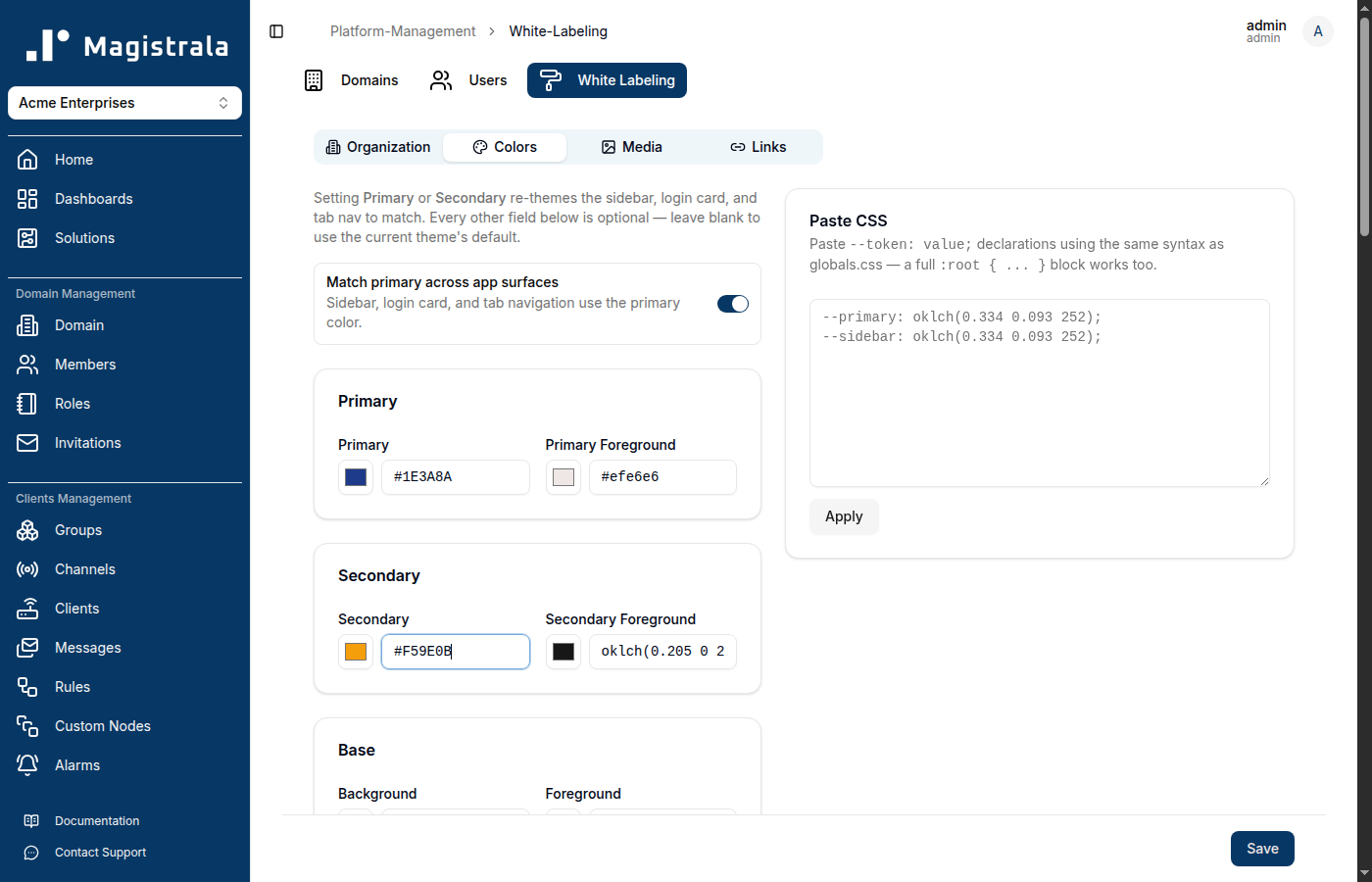
Note: color changes don't preview live on this page as you type — you'll see the new theme applied once you click Save.
Media
The Media tab handles every image asset: the main logo, the collapsed-sidebar logo, the favicon, and the social share image. Each upload accepts an image up to 5MB.
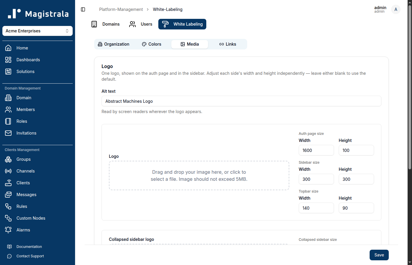
Logo
This single Logo upload is shown both on the login/auth page and in the expanded sidebar (and in the top navigation bar shown before a workspace is selected) — you don't upload separate images for each. Because it appears at different sizes in different places, you can set width/height independently for each surface:
- Auth page size — the login screen
- Sidebar size — the expanded sidebar
- Topbar size — the top bar shown pre-workspace-selection
Use an SVG (or another format with a transparent background) sized roughly to its widest expected use — the width/height fields scale it down for the smaller placements, so a crisp source avoids blurring. Set Alt text too; it's read by screen readers everywhere the logo appears.
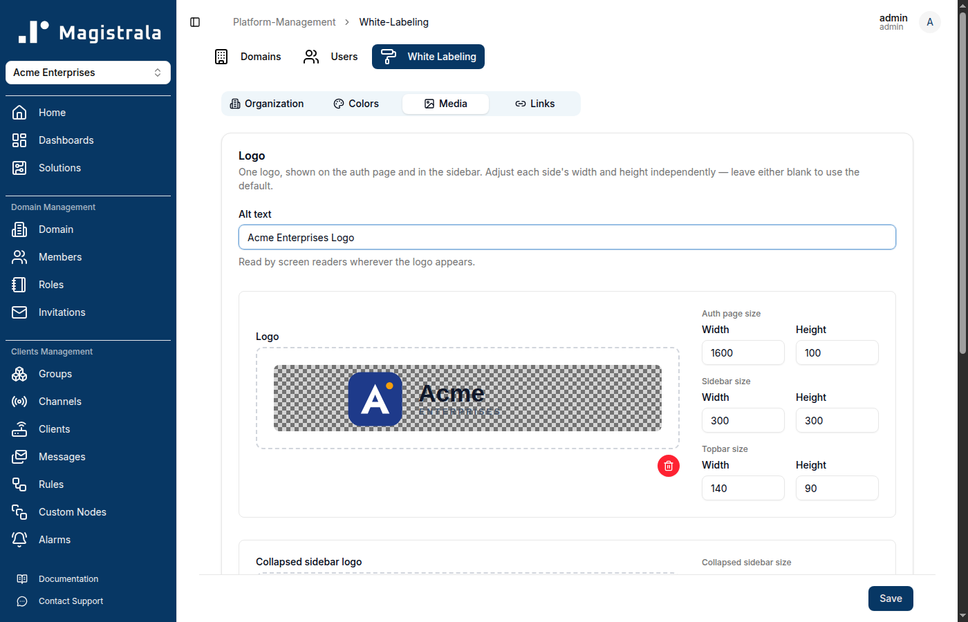
Collapsed sidebar logo
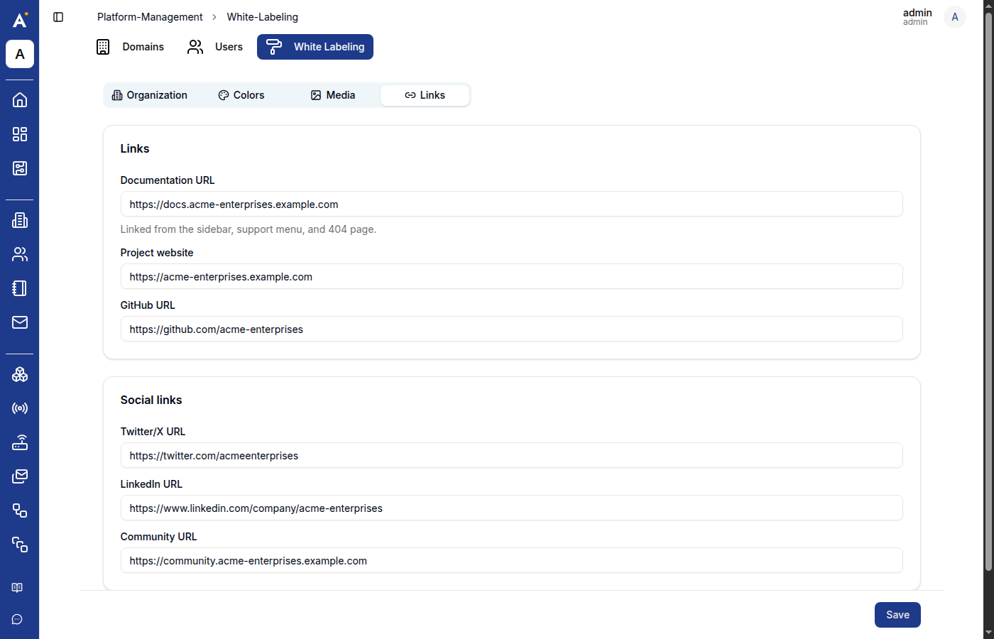
A separate, smaller upload for when the sidebar is collapsed — normally just your icon/mark, without the wordmark, since there's much less horizontal space. This is the image users will see most often, so keep it simple and legible at a small size.
Favicon & social preview
- Favicon — shown in the browser tab. Use a small square image;
.ico,.png, or.svgall work. - Social share image — shown in link previews when a URL to this deployment is shared on social media or in chat apps (Slack, Discord, iMessage, etc.). The conventional size is 1200×630.
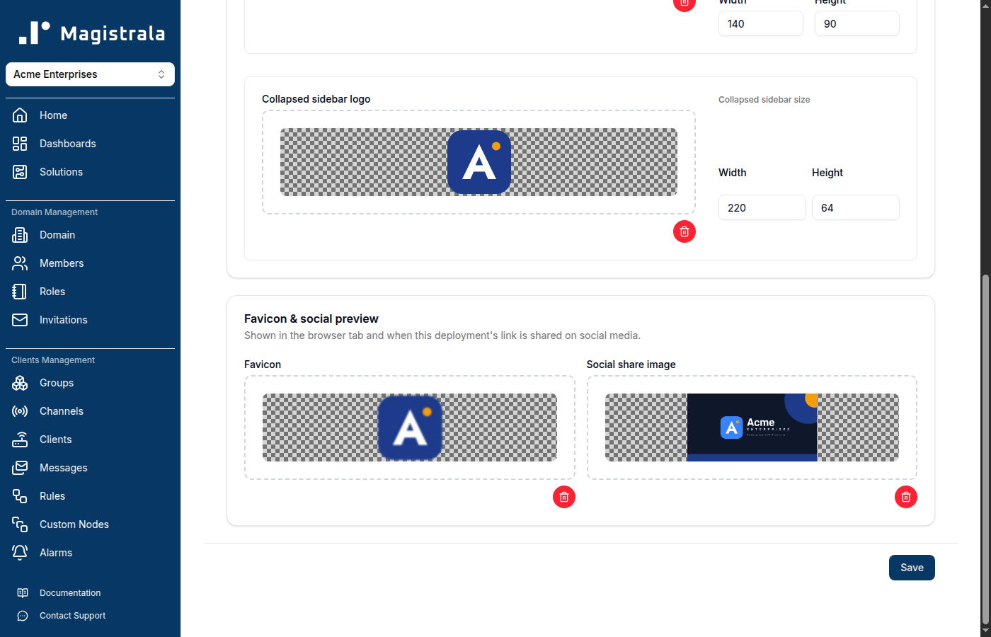
Every upload shows a live thumbnail against a checkered (transparency) background as soon as it's chosen, and a red trash icon to remove it before saving.
Links
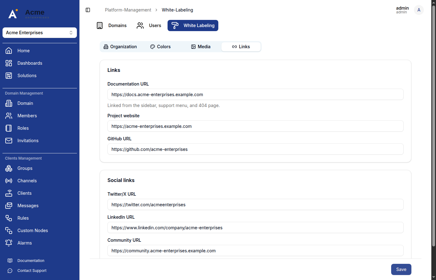
The Links tab controls outbound URLs shown around the app: the Documentation URL (linked from the sidebar, the support menu, and the 404 page), Project website, GitHub URL, and social links for Twitter/X, LinkedIn, and Community.
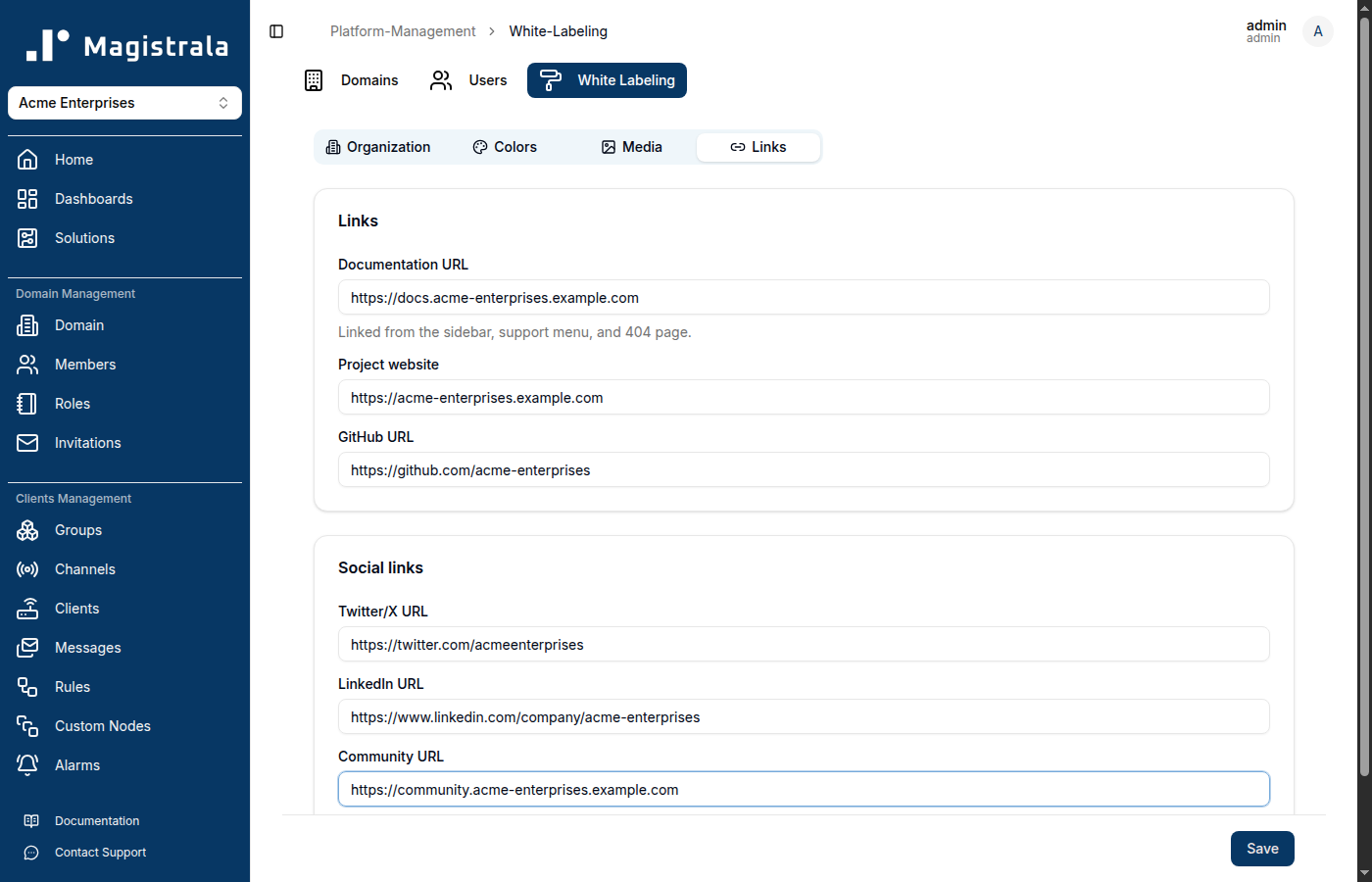
Leave any of these blank to fall back to the deployment's built-in defaults rather than hiding the element entirely — an empty field doesn't remove its link from the UI.
Saving
Click Save at the bottom of the page to write every tab's changes at once — there's no per-tab save. The new branding takes effect immediately: page titles, the sidebar, the login page, the favicon, and the social share image all update right away, with no separate cache-clearing or redeploy step needed.
After saving, the White Labeling page itself reflects the new branding:
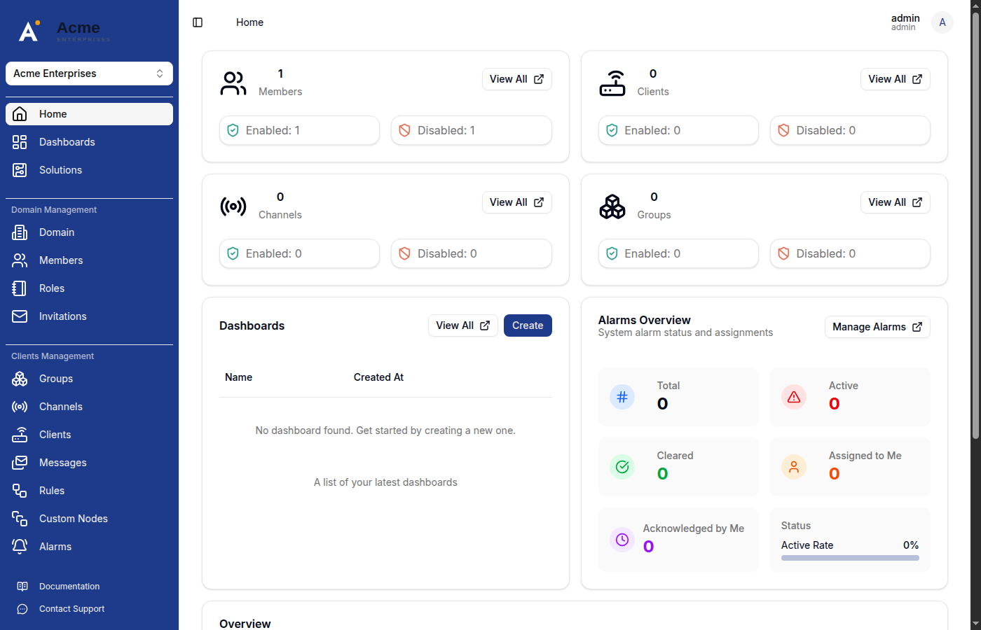
So does the rest of the app — here's the workspace home page:
Collapsing the sidebar swaps in the smaller Collapsed sidebar logo:
And the login page picks up the new logo and Primary color as the login card background:
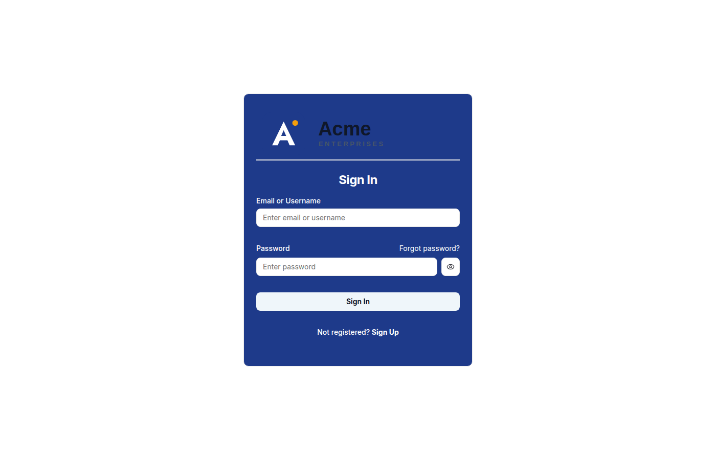
Design tip: if "Match primary across app surfaces" is on, your login card background becomes your Primary color. Make sure your logo's wordmark (not just its icon) is legible against that color — a dark wordmark designed for a white background, like the one above, can end up low-contrast on a colored card. Test the login page after saving, not just the sidebar.
Summary
| Tab | Controls |
|---|---|
| Organization | Name, description, keywords |
| Colors | Primary/Secondary theme colors, and every underlying design token |
| Media | Logo (auth + sidebar + topbar), collapsed sidebar logo, favicon, social share image |
| Links | Documentation, project website, GitHub, and social links |
All four tabs share one Save button — fill in what you need across any of them, then save once.